Wednesday, June 3, 2015

Creative Unit

Symmetrical Patterns

Vertical Strips

Hand-Color

Image Overlays

Texture Screen

Halftone


Double Exposure

Over all I really enjoyed this project I thought it is a great way of expressing our individuality so I found it very fun. I wish we had more time to work on this but I'm still glad we did it, I actually like doing projects like this because I like working with simple photography and turning into something unified and out of the ordinary. 


Tuesday, May 5, 2015

Motion Final

Frances Recibe, Emma Clahane
Blurred Motion


Emma was behind the camera and I ran and allowed her to take the photo. We were proud of the outcome.


Panning Motion

We had Zac run from one end of the field to the other. We were content with the photo because his hand is blurry.

Frozen Motion

We just told him to hit the ball and tried to get it before he actually hit the baseball. It took a couple of tries but it worked and we're happy with it.

Zooming 

I took this outside my bedroom window and was happy with the results because of the illusion that what's outside is and inside and whats inside is outside.


Writing with Light

For this shot I wanted have this illusion to what I do when I get home by marking where I go and what I do. I was very pleased with the shot because it captured my idea.

Chrono

For this photo I had the idea to show Emma's sides and this is what we came up with. We we're pretty happy with what came out editing wise.


Wednesday, April 22, 2015

Motion Planning


Blurred Subject
We wanted to shoot in the woods of somebody running in it and have them clear while the rest is the same and it focuses on the subject.

Panning

We wanted to use Emma sister as the subject of the photo and have her running.


Freeze Motion
For freeze motion we wanted to make it interesting like someone throwing a lacrosse ball.


Zooming
For zooming we wanted to use a flower or something with words written in it so it doesn't seem boring.


Writing with Light
We wanted to outline a the subject and we really didn't want to use a person as a subject we wanted something more abstract and unique.


Motion Shooting Assignment


Monday, April 6, 2015

Writing with Light Group Project

f/4.5
ISO: 400
f/4.5
ISO: 400


Sarah Chambers, Kendra Sober, and Frances Recibe

I really like the idea of writing with light I thought it was a fun and interesting experiment. I can admit that it was hard to capture and very challenging to have everything be fixed and going for the subjects. For example the ISO the f-stop and trying to have a clear subject whilst in the dark. But overall I liked it and I think I'm really going to like learning about motion.


Wednesday, March 18, 2015

Lighting Final

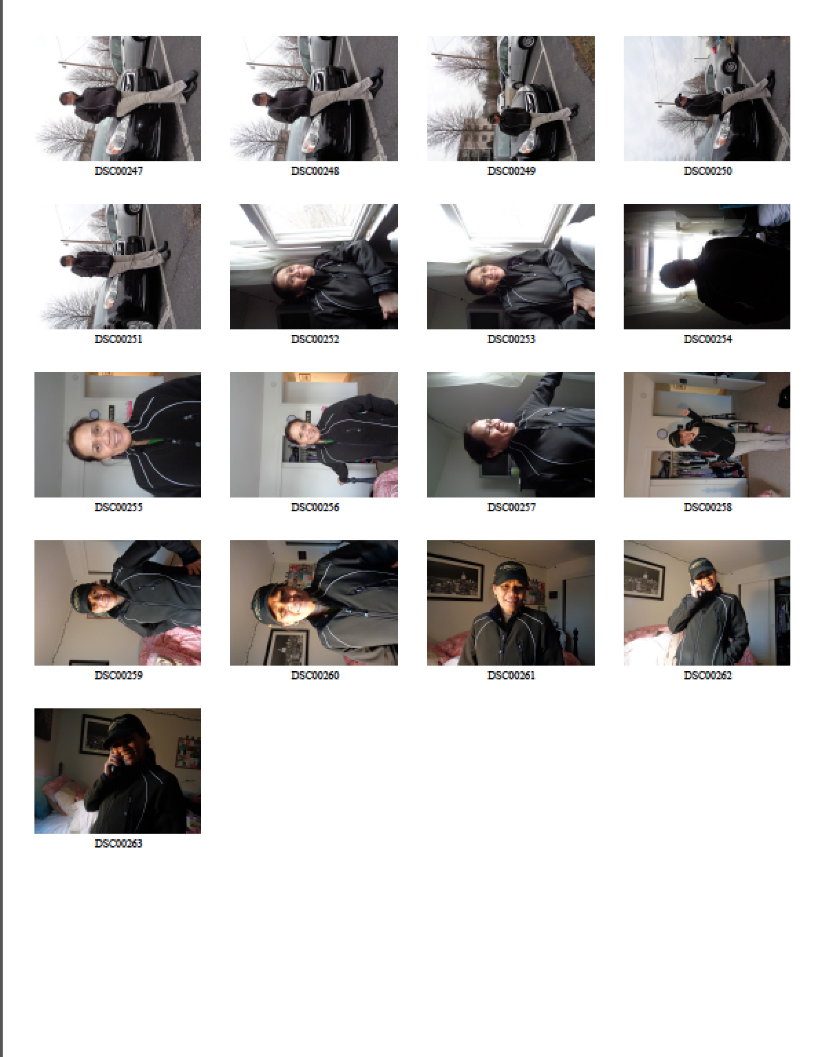
For this project I choose my mom as my subject. I choose her because my mother and I have been together since the day I was born so she has definitely made quite an impact and who I am today. For each photo I asked her to wear her uniform for each shot since she is always on the go and at her job, I also included her car to emphasize of the idea of her always on the go. And to add to that idea of her being busy all the time, I made her pose either outside or inside. For each photo I only made her either smile or be serious because she rarely shows any other emotion. This unit has definitely effected the way I take pictures because I know now that lighting does contribute a lot on how the person is feeling and how they want each photo to be interpreted. My mother is important to me because she has always been there for me and I know she always will be.
Natural
Existing
Existing
Natural


Artificial

Friday, March 13, 2015

Silhouette

Pattern

Solid 

Shape

Gradient

I actually enjoy taking silhouette photo's whether it be non-traditional or traditional because I just like how a shadow can also portray the subjects emotion without the their facial feature to do it for them.Yes I like photoshop it just takes time to learn which is alright. I really like the outcome of all the pictures. 


Wednesday, March 4, 2015

Lighting Project

Natural Light

For natural light I learned that shade has more of a balance specially towards the blacks,whites and greys. While the natural light create harsh dark shadows and doesn't have much of balance.If I was to do this again I would ask my subject to not look either directly to the camera or the sun.
Natural Light
Shade Light


Existing Light

For existing light I learned that different directions of how the picture is take does affect the way the picture turns out and where the deepest darks and lights are. If I was to do this again I would try to focus more on my subjects eyes because they seem to capture a lot of reflection detail. 
Front
45 Degree


Back
Side


        Artificial Light (Single Source)

I learned that artificial lighting is very different from natural and existing. I found it interesting that artificial light are able to mimic how natural and existing affected the face. I also learned that there are different ways of taking a picture it's not just a simple portrait style.
Butterfly
Loop
Silhouette
Hard
Soft


Split
Rembrandt


Artificial Multiple Lights

From using multiple lights I learned that one, two, and three's pairs of lights do make a difference. You can see with one light which is key it doesn't create that sense of balance within the photo.
Key Light
Back Light
Fill Light